Posted 16 April 2020
So what of today? I have started today’s ‘piece’ about coronavirus no less than four times today. Each time I start, I have a particular theme but then some new item appears and it changes my thoughts and direction and so I start again.
The one I am going to finish today is in response to an article in the Spectator today. A real curate’s egg of an article: very good in parts, not so in others.
The article is called “Six reasons why it is a mistake to compare countries’ coronavirus figures’. And yes, whilst I absolutely agree it is a mistake to compare the data from different counties without any understanding of what is behind those data, it would equally be unwise to ignore the data from other counties.
Let me list his six reasons, all great and all spot-on:
1. Population density – some countries have more sparse populations, some are densely populated. The transmission of a contagious agent in those counties is going to be different.
2.. Co-orbidities are different in different countries. There is a lot of data showing that severity of symptoms of COVID-19 are highly correlated to underlying metabolic health issues. The prevalence of these will vary country to country.
3. The number of epicentres? Did the virus arrive in that country and stay concentrated in one area. Or were there multiple epicentres. That will change the scale of the epidemic.
4. How is association with COVID-19 is recorded? Different countries use different test tools and different criteria (non test based) to determine if a case is COVID-19. Different criteria in different countries makes absolute numbers difficult to compare.
5. Dying ‘with’ or ‘of’ COVID-19. Different countries have different ways of distinguishing is death due to Coronavirus or did it accelerate death that might have happened anyway or is it completely unrelated to COVID. Even within a country different institutions may have different approaches to this.
6. The collateral deaths. More suicides, deaths due to poverty and the like may increase because of measures taken to combat COVID-19 and these rates may be different in different countries. [I confess, on this one, I am not sure how this impacts COVID-19 death data between countries unless, somehow, some countries are including these in COVID-19 deaths and some are not].
All of these are pertinent issues with regard COVID-19 data collection and it is good analysis to highlight these.
My issue with the article is the suggestion that these are barriers to comparing data between different countries. I would just argue that they are factors that have to be considered but not a bar to making meaningful comparisons.
Let me make a comparison and a cautionary one. Over the last fifty years the developed world has followed a paradigm of low fat diets and yet now the populations in those countries have the highest levels of chronic non-communicable disease (very relevant to susceptibility to COVID-19 infection).
The low fat paradigm is based on epidemiological data from different countries. That original analysis failed to make allowance for many differences between those countries including key cultural, social and health differences as well as data collection methods, data recording methods and definitions of illness and death. Re-analyis of the same data now shows that if these had been taken into account, the evidence that dietary fat was bad would not have been reached. OK, thus far in my comparison, this supports the advised caution of the author of this Spectator article not to compare the COVID data in different countries.
BUT, within that same diet and health data from the different countries, if intelligent allowance had been made for the potential differences between countries and country-by-country analysis made with the suitable caveats, there was already evidence of the harm of processed foods, man-made vegetable oils and refined added sugar. Had this been done at the time, the medical paradigm and the metabolic health of the population might now be different.
So my point: Yes, be very careful of comparing apples with pears but do not throw away all of the useful information just because they are apples and pears – they are still both fruit!
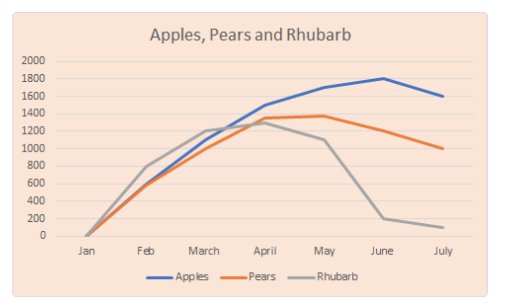
In the article, and this is the image attached, the author shows a hypothetical graph of the dangers of comparing apples and pears and also rhubarb (obviously not a fruit).
If you look at his fruit and rhubarb charts, yes each curve has different ordinate to co-ordinate scales but the shapes of the curves are very similar and if we had the rest of the year data, they might be identical! Different in scale but identical in shape. And that is what the country to country COVID-19 analysis is all about – the characteristics not the scale. No one is saying (from papers I am reading, anyway) for example, that because the peak death rate in country A is X, country B should have the same rate. Or, because in country C it was 8 weeks between start of cases to peak it must be 8 weeks in country D. The five/six reasons he lists put pay to that.
I do not think analysts of value are doing this sort of comparison as he is suggesting between countries with the COVID-19 data – the mainstream media might but I am trying to avoid those so cannot say for sure.
But the shapes of the curves are useful and comparing countries is useful. Let me give two examples.
Sweden have chosen a very different approach to full lockdown. So here is a question: has that choice made a difference to outcomes. There is not another Sweden that chose another route with which to perform a direct comparison and that would be the only true valid comparison, again because of the six reasons he gives: You can only compare the absolute numbers in countries where all other factors are the same. But, here is the statistically important point (and I am going to quote Malcolm Kendrick, who has much discussed mis-use of statistics in medicine): “Association does not prove causation but lack of association does dis-prove causation”.
So, here is the test: If lockdown made a difference, there would be a difference in the shape of the curves between Sweden and a country that did implement lockdown. BUT even if there were a difference in the shape of the curves, that would not prove that lockdown caused the difference, it could be due to something else that is also different between those two compared countries (again going back to his list of six points). Taking the Kendrick point though, if there was no difference in the curves in the comparison, then you have DIS-proven the theory that lockdown makes a difference. Comparing the curves is useful.
My second exemplar of comparison of shapes of curves is very close to home regarding the COVID-19 reporting in Care Homes. There will be a step change in our data in the next few weeks because of planned changes to testing in Care Homes. The shape of the UK curve will have an extra spike in it. But by performing a country to country comparison of the shapes of the curves will give the UK useful information in how sensitive the curve data is to changes in recording strategy. It does not matter where the vertical and horizontal scales of those comparison curves are, it is the shape and characteristics that are compared.
I could even play along with the author’s example. The rhubarb curve is ‘locally complete’, i.e. whatever is being measured on the vertical axis has pretty much returned to start of year levels within the seven months graphed. The curves for the fruit have not. But, although rhubarb is not a fruit the bits of the curves we have for all three foods have similar characteristics, different scales, but similar proportions. So, it would not be unreasonable to create an hypothesis and make some predictions about the missing bits (later in the year) of the curves for apples and pears. These would be working hypotheses that real data may prove or disprove, but they nonetheless would offer insights that would be missed if the data were ignored.