Posted 20 May 2020
Here are two interesting perspectives.
The website Euromomo provides total death figures for 24 participating European countries. It shows the death data as a week-by-week time series since 2016. (The first attached picture)
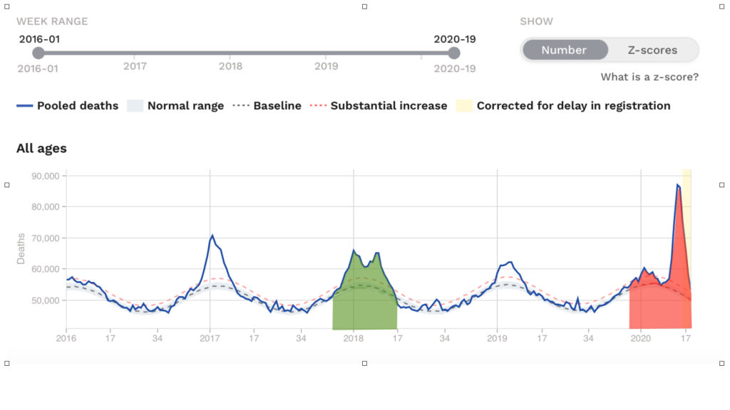
The total death time series is the blue solid line; the grey dotted line is the rolling average.
You can clearly see the ‘winter peak’ in deaths that occurs each year around the start of each year.
The total deaths in the 21 week period from week 49 to week 17 in winter 2017/18 is shown in the green shaded area (my annotation to the graph). I start this analysis at week 49 as generally that is the first week deaths start to exceed the rolling average for the ‘winter peak’.
The total deaths in the same 21 week period of 2019/2020 are shaded red (again my annotation).
If you calculate the area in green this equates to 1,257,073 deaths in those 21 weeks of 2017/2018 Note: The vertical axis of this graph does not start at zero but I have taken that into account.
The area in red equates to 1,313,051 deaths – this is therefore the total deaths in the same 21 weeks of 2019/2020, again corrected for the non-zero vertical axis.
Comparing 1,313,051 with 1,257,073, there are 4.5% extra deaths in week 49 to week 17 of 2019/20 compared to the same period in 2017/2018.
Just 4.5%!
The graphs suggest that up until the arrival of COVID19, Europe was experiencing a winter of low seasonal deaths in 2019/20. COVID19 has effectively given us a ‘late winter season’ of deaths, but currently only 4.5% above the deaths in the 2017/18 winter season. 2017/18 was a bad flu season but not one that required lockdown and indeed was mostly unnoticed by most people.
The COVID19 season has not ‘finished” but by week 17 (the latest week of data available) the curve is nearly back to the rolling average.
The second graph is taking some interesting data where the ‘severity of lockdown’ has been assessed on a scale from 0 to 100 for 20 countries. This is then plotted against the COVID19 deaths per million population statistic for each of those counties. I have labelled the UK datum on this graph.
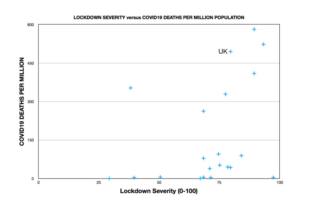
There is no correlation between severity of lockdown and the deaths data of those 20 countries.
Two very interesting sets of data that do not really concur with the prevailing narrative of fear.