Posted 22 May 2020
“WITH STATISTICS, I CAN PROVE EVERYTHING BUT THE TRUTH”
George Canning
A few days ago there was an article (I did not see the piece myself but a few comments on Facebook pointed to it) claiming that Sweden now had the worst COVD19 death rate of any European country.
This took me quite by surprise. As a ‘non-lockdown’ country, Sweden’s outcomes are an important counterpoint to most other countries, the U.K. included, where lockdowns have been implemented. With all the caveats about country-to-country comparisons, I had been regularly looking for anything in the Sweden data when compared to elsewhere that might give insights into lockdown. For a week or more I had not been looking at the data and so I was alarmed to hear via the headline that Sweden’s fortunes had apparently changed so much whilst I had been looking the other way.
When I did refer back to the raw data, I could not see anything to confirm the headline. Though reassuring to see that the fortunes of the Swedes had not reversed in a week, I wondered where the reported headline had come from.
Then I saw another similar headline myself yesterday (The Telegraph):
“Sweden becomes country with highest coronavirus death rate per capita for last 7 days”
The penny tumbled and checking the story confirmed that the data being compared here were seven day averaged daily new deaths data rather than the increasing cumulative deaths data. So, was I missing something by looking just at the total deaths data?
And yes, I can now see where the headline comes from.
To make analysis easy, the seven day rolling averages of COVID19 deaths are already collated on ourworldindata.org.
Between 14 May and 20 May, Sweden did indeed have the highest seven day rolling average of deaths per head of population of any European country. The UK however took-back the lead yesterday.
So, thinking about the Telegraph headline, when Sweden were in the ‘top spot’ of COVID19 deaths, were we beginning to see evidence that perhaps lockdown was the right thing to do after all? Has last week’s data started to reveal Sweden to be a COVID19 disaster?
My view: Not at all.
Opinion first, data later.
Governments who opted for lockdown will have to face the crippling reality of the economic destruction it brings. And they will be facing it for many years. If a handful of countries kept COVID19 infections in some sort of control without lockdown thereby avoiding ‘deaths later’ due to recession, then there will be some rather big awkward questions for the locked-down countries to address.
It would be a useful narrative therefore if Sweden were seen to ‘fail’ in its COVD19 management. The awkward questions are then avoided for everyone else.
I wonder if this sentiment prompted the headline: “Ah ha, Sweden. See, you got it wrong”, a fist-full of accusatory fingers pointing in her direction.
My analysis is a little more open ended.
Different countries have different strategies for recording COVID19 deaths. This has always been the big point of not directly comparing absolute deaths numbers between countries. But trends and timing of peaks are a little more comparable.

Compare Belgium and Sweden (first graph). Belgium has experienced the highest deaths per capita of all countries (but consider my point of country to country differences in measuring and recording COVID19). Belgium locked-down; Sweden did not.
Remember how we thought locking down would “flatten the curve”? As my analyses in April first showed, locking down does not seem to have flattened the Belgium curve compared to Sweden. Sweden’s looks distinctly flatter despite absence of lockdown. There were and continue to be ‘soft’ social distancing measures in Sweden and so maybe these are enough to flatten her curve.
There are two further differences between the curves I would note. Firstly, the fall-off of the curves: Belgium has a steeper descent from peak than Sweden. Secondly, the Belgium fall in deaths is much smoother. Both curves show seven-day smoothed rolling average data but still the Sweden descent is more irregular.
Either of these differences could be attributed to lockdown. Is the shallower decline in Sweden for example because prevalence of the infection in the non-locked down is higher but still declining as Sweden’s population reaches infection saturation? Belgium, like all countries in lockdown, still has the worry of a second ‘peak’ due to easing lockdown; Sweden does not have those concerns – schools, business, gyms, shop, bars, restaurants remain open.
The differences in the fall-off could be attributed to other differences too, such as differences in the Spring climates in those countries or their population densities. I guess we will never know for sure the reasons. But for me, the two key point remain: Sweden’s curve is still downward despite no lockdown and no post-lockdown second peak to worry about.
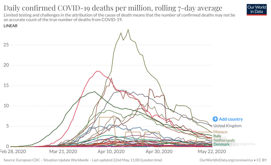
The second curve shows most of the European countries on the same slide. You will notice we are all now in the ‘rugby scrum’ of data at the right hand edge of the graph. Very little sets us apart now despite differing strategies and different timings, different population densities and so on. The UK is the ‘head’ of the pack now having just wrestled that crown from Sweden in the last couple of days.
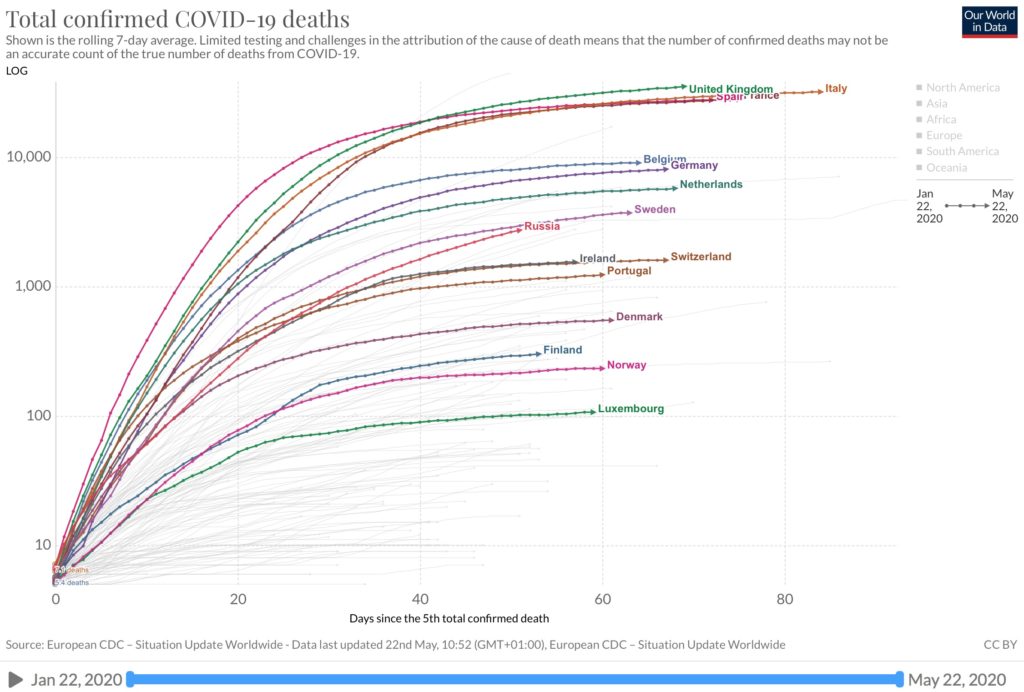
The final graph shows total cumulative deaths (the data I normally look at) and you can see Sweden nestling where it has consistently been for most of the last eight weeks – middle of that pack, a pack headed by lockdown countries: UK, Italy, Spain and France.
The reports of Sweden’s downfall are, I fear, greatly exaggerated.