Posted 20 April 2020
GEEK ALERT!!
OK, so I was going to have a day off from numbers…. but then I found the website OurWorldInData and I have been playing all day!
What is so wonderful about this website, is it provides raw data on virtually everything you might want to know.
So, what better than to look at the data of ‘COVID-19 cases by day by country from 1 January 2020’?
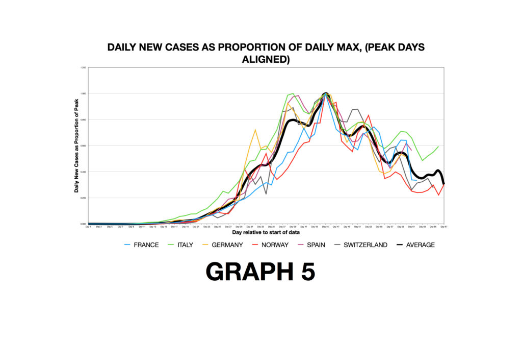
This then got me playing. I took the data for just six European countries, France, Italy, Germany, Norway, Spain and Switzerland. Within these countries there is a good mix of high and low population densities and high and low testing rates, case levels and mortality rates. There are also a mix of lockdown strategies in these six too.
THE PLAN: To see if there is any uniformity in the ‘curves’ for these six countries that might give us useful information for other countries (i.e. the U.K.)?
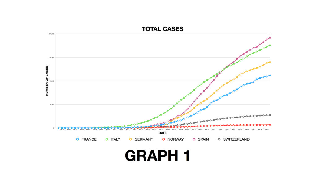
GRAPH 1: The raw data of cumulative cases of COVID-19 over time. Each country has different methods of measuring and testing and different total populations hence the big differences on where each country’s curve sits on the vertical axis, but note the shapes of the curves have similarities.
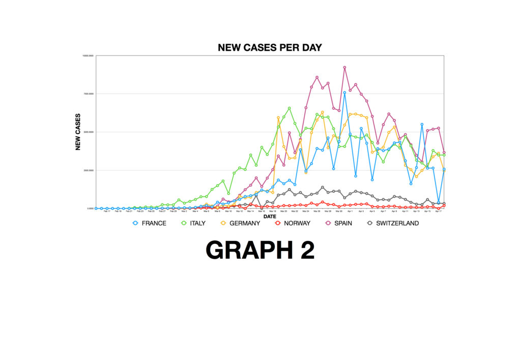
GRAPH 2: Rather than cumulative cases, this graph plots the new cases per day calculated from the data in Graph 1. Notice each country has had a peak, and new case numbers are now decreasing in all six countries.
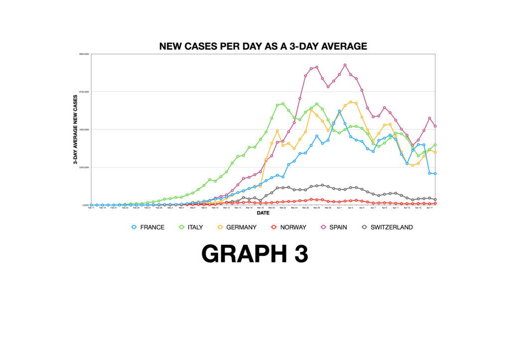
GRAPH 3: Performing what we call smoothing: Because daily reporting of cases can be subject to variation, I have taken a 3-day rolling average of the new case numbers. Notice this takes some of the jaggedness out of Graph 2. Still the same data, just slightly smoothed.
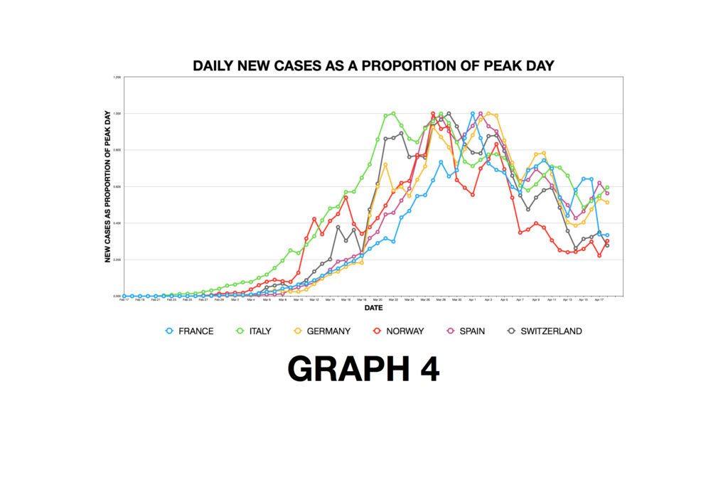
GRAPH 4: ‘Normalising the Graphs’. Because the countries have different populations and yet I want to make the curves comparable, I have used a technique to put the vertical axis for each country on the same scale. [The tech bit: The daily number of new cases reached a peak in each country. For each country, I have expressed each day’s new case number data as a proportion of that country’s peak]. This puts all the country’s new case data on a scale from 0 to 1.
GRAPH 5: I have now moved the curves for each country horizontally so that the peak day for each country occurs on the same day. This allows to make a fair comparison between countries even if the outbreaks started at different dates. I have also cast on this graph (the solid dark line) a curve which is then the average of the six country’s curves. Notice from this graph that the peak new case day occurred around 33 days after cases started appearing and this is true for all six countries. This is despite each of the six countries implementing different isolation and lockdown strategies at different times.
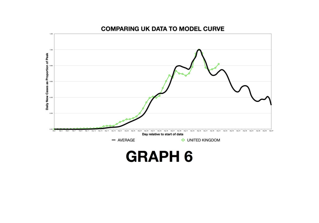
GRAPH 6: Having created an ‘average’ curve – which is like a working model – from six very different European countries, I now compare that to the UK data. The UK curve follows the average curve very well. The shape of our curve has pretty much the same features of an average curve created from six very different countries (remember the vertical axis is normalised so cannot tell us about absolute case numbers expected in the UK). If this model is a reliable working model it means new case numbers in the UK are on the decline and have been for nearly a week. Notice that our peak also occurred about 31-33 days after cases started.
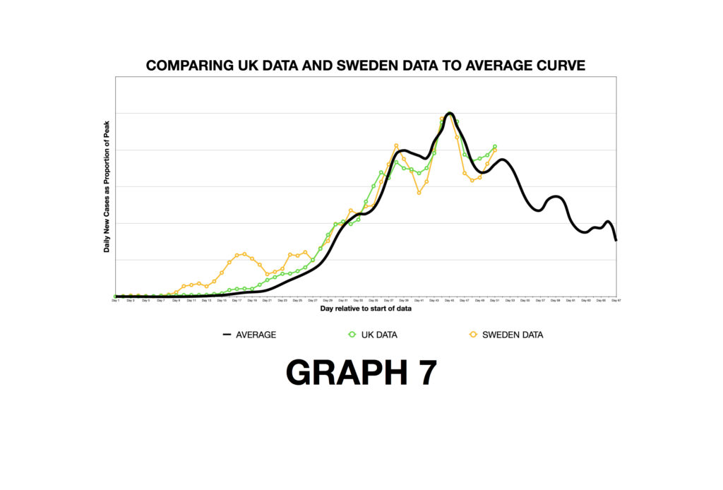
GRAPH 7: Sweden adopted a very soft approach to social distancing. There is no enforced lockdown. So, if we have a model curve (my black line) of European countries with harder isolation measures, how does the Sweden curve compare? Apart from a little peak in the early days, the Sweden curve so far is little different: the shape of the curve and the time to peak new cases from first case is about the same as both my average curve and the UK curve. Perhaps lockdown makes no difference?
What is interesting is that I can keep updating this model daily as new data arrives. I can also monitor countries that start to ease lockdown measures and see what differences that makes to the curves.
Gotta love a good spreadsheet!