Posted 1 May 2020
Yesterday I pointed an accusatory finger at Media/Social Media for enflaming the pandemic of fear. Today I lift my cap at how Google searches give us an insight into the progress of the viral pandemic.
Big thanks to Fiona for sending me the link to a Public Health England report (if anyone sees a data report you that you think I may find interesting, then do send it to me. I am definitely in ‘sponge’ mode for absorbing anything and everything).
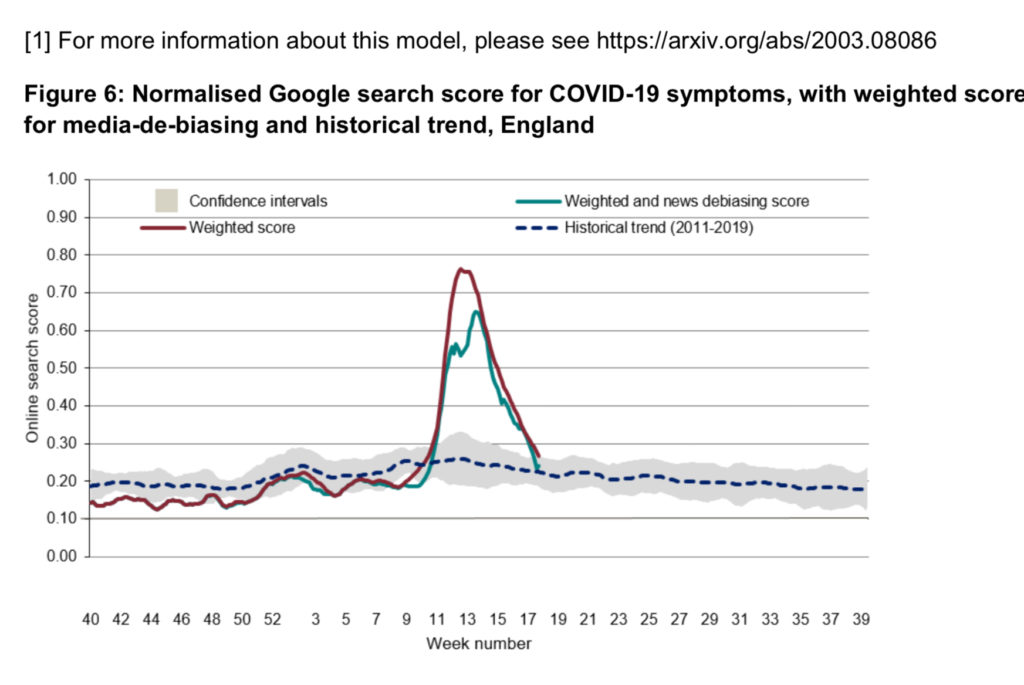
Within that PHE report is a graph that really piqued my interest (the first picture attached to this post) and is a really positive (I think) way Social Media can be recruited in the campaign to convert data into information.
The graph shows how Google searches for ‘all things COVID’ can be used as another barometer of the progress of the pandemic. This particular graph looks at searches for COVID-19 symptoms. The red line is the curve of searches for symptoms (for example ‘breathlessness’, ‘dry cough’, ‘headaches’, ‘fever’ etc). It is ‘weighted’ according to the prevalence of each searched symptom in COVID cases. For example, fever is reported as a symptom in most symptomatic cases of COVID whereas diarrhoea is seen only in a few cases. Searches for ‘fever’ and ‘diarrhoea’ are therefore weighted accordingly.
The bluey/greeny line (I am hopeless with colours – give me numbers, give me numbers!) is then de-biased according to news stories. So if the BBC news (say) had a major story on COVID that discusses breathlessness, this would generate extra Google searches for that symptom on that day. As the Google analysis is intending to give a window on searches for symptoms that people actually have (rather than what they are worried about because they have seen it on the news) the data has been de-biased accordingly.
So, to use a vernacular, this graph is attempting to look at how often ‘Dr Google’ was used by people worried about symptoms they were presenting that could be COVID related.
I am fascinated how the shape of peaks of the Dr Google curves is such a good match to the PCR positive testing curves – that is, the confirmed cases numbers reported by the NHS. I would obviously expect them to be linked, but such a good correspondence does amaze me.
And just as confirmed new cases is now on steep decline here, so too are the Dr Google searches.
The grey ‘curve’ at the base of the graph, with the blue dashed line, is the normal rate of Google searches for the same symptoms – ‘fever’, ‘diarrhoea’ and so on – over the last 8 years.
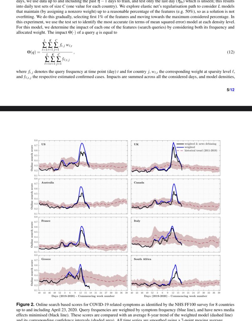
The second picture intrigues me further as this is the comparison of similar curves for the UK and 7 other countries.
The confirmed cases curves in Italy has more peaks on its ascendancy from New Year 2020, and so does the Dr Google curve.
South Africa is behind European countries with lockdown and peaks in reported cases and this is accurately reflected in the Dr Google curves. [As an aside, on a webinar yesterday with Cape Town university, I learned that their lockdown is even stricter than ours as they are not allowed out for exercise or to walk their dogs].
The ‘baseline’ searches for symptoms (the pink broad cure on each graph) is interesting too. What’s going on with Greece? They are routinely so much more into their Dr Google searches than (say) Australia. But as of last week they were so uninterested in asking Dr Google about symptoms, that their levels of symptom searches are well below the normal weekly average.
I find all of this fascinating (…I need to get out more….) but I am intrigued as how tracking Google searches might have a meaningful contribution in tracking any future pandemic illness….or rebound curves on this one.
Of course, there is a downside. It is yet more proof that Google perhaps knows more about us than we do…..discuss!